


Project Overview
In the given case study, the individual was provided with data from a
manufacturer and retailer known as Turtle Games. Turtle Games operates
globally and offers a range of products, including books, toys, board games,
and video games. The individual was tasked with analyzing the company's
sales data and customer reviews to gain insights into overall sales performance
and identify areas for improvement.
To conduct the data analysis and present the findings, the individual
utilized R/RStudio and Python as the primary tools.
The analysis also encompassed the examination of the following key areas:
• How customers earn and accumulate loyalty points.
• How different customer segments within the customer base can be
targeted for specific market strategies.
• How social data, such as customer reviews, can be utilized to shape marketing campaigns.
• The impact of each product on sales performance.
• The reliability of the data, considering factors like normal distribution, skewness, and kurtosis.
• Identifying any potential relationships between sales in North America, Europe, and the global market.
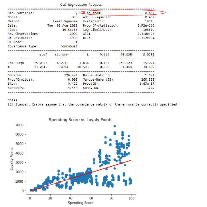
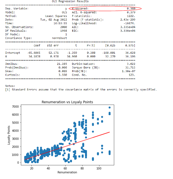
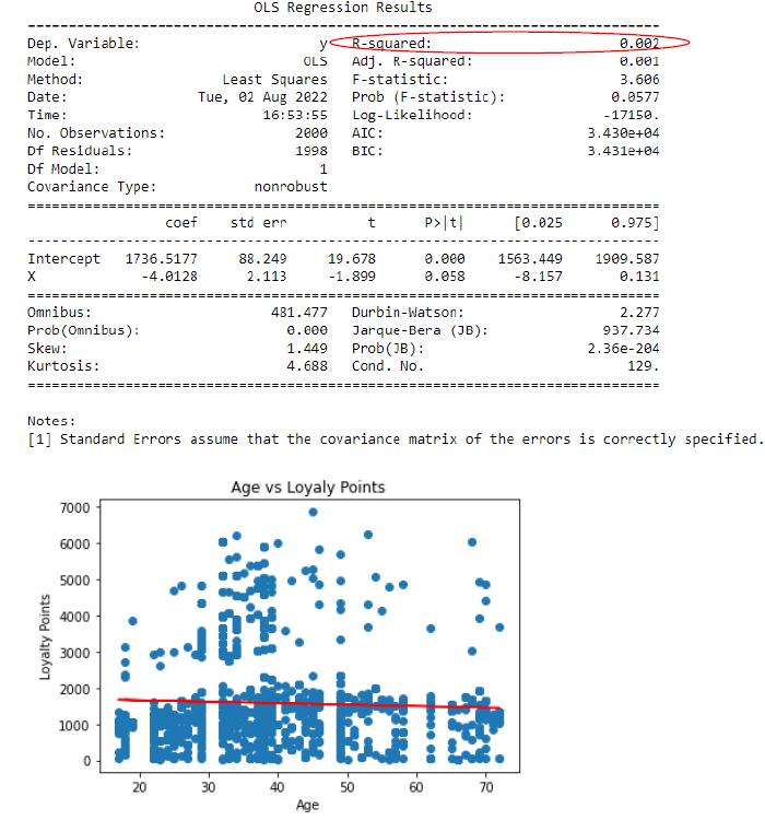
Based on the findings presented in Figures 1-3, it is
evident that the r-squared values for all three models are considerably low.
Specifically, the r-squared values are 0.45, 0.38, and 0.002 for spending score
vs. loyalty points, renumeration vs. loyalty points, and age vs. loyalty points,
respectively. A higher r-squared value, closer to 1, indicates a better fit of the
regression model and explains a larger proportion of the total variation in the data.
The scatter plots reveal a slight positive relationship or linearity between spending
score vs. loyalty points and renumeration vs. loyalty points. The regression lines in
the plots help visualize this connection. However, no discernible relationship exists
between age and loyalty points, suggesting that further exploration in that direction
is unnecessary.
Considering the involvement of multiple variables,
it might be beneficial to consider a multiple linear regression model instead.
Expanding upon the analysis conducted with the linear regression models,
let's focus on the utility of renumeration and spending scores in identifying
distinct groups within the customer base for targeted market segmentation.
To accomplish this, we can employ k-means clustering.
To determine the optimal number of clusters for our dataset,
we can utilize the Elbow or Silhouette methods. These methods indicate that
testing out 4-6 clusters would be appropriate.
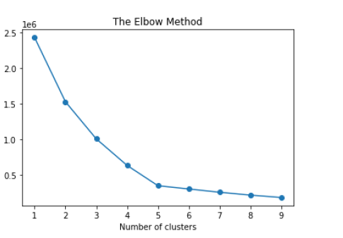
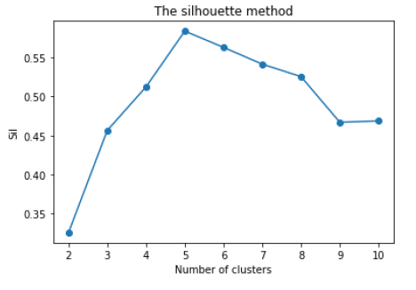
Based on the analysis and evaluation of the methods and models mentioned above, it can be concluded that utilizing 5 clusters yields the most distinct separation and grouping. It is important to note that this selection is subject to some degree of subjectivity, as unsupervised models like k-means clustering do not provide predetermined labels. Without expertise in the specific field, determining the ideal labels for the clusters becomes challenging and uncertain. This is recognized as one of the limitations of unsupervised models, where the interpretation of results can be subjective, especially when clear and definitive labels are not available.
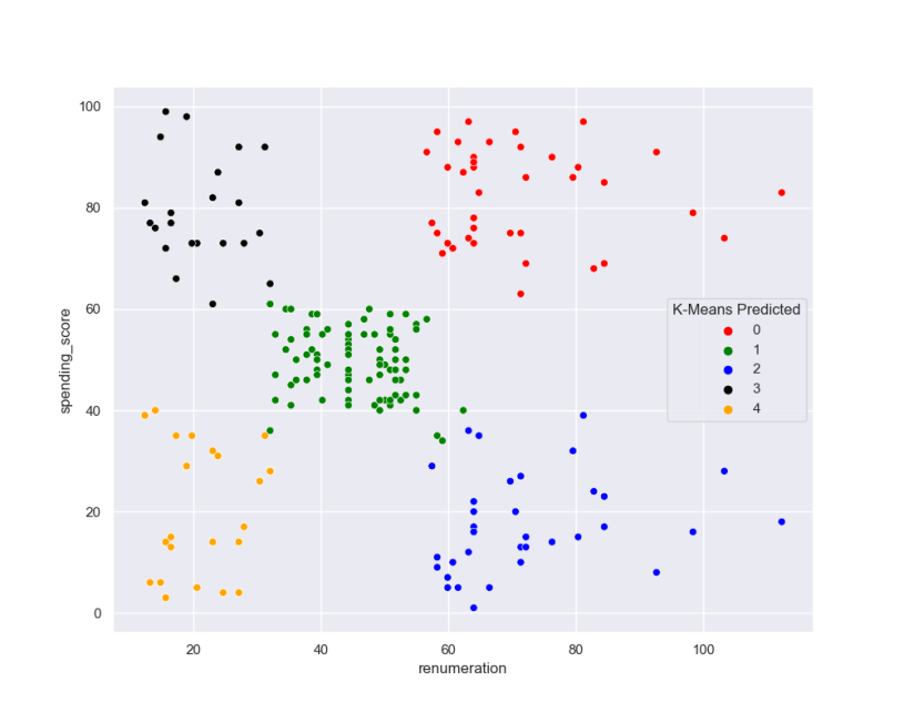
Upon observing the k-means model depicted in Figure 6, it becomes evident that the
clusters/groups exhibit well-defined boundaries, with minimal overlap among the data
points from different clusters. The characteristics of each cluster are as follows:
- Cluster 1 (red): Represents a higher income group that spends more.
- Cluster 2 (green): Corresponds to an average income group with average spending habits.
- Cluster 3 (blue): Represents a higher income group that spends less.
- Cluster 4 (black): Represents a lower income group that spends more.
- Cluster 5 (orange): Corresponds to a lower income group that spends less.
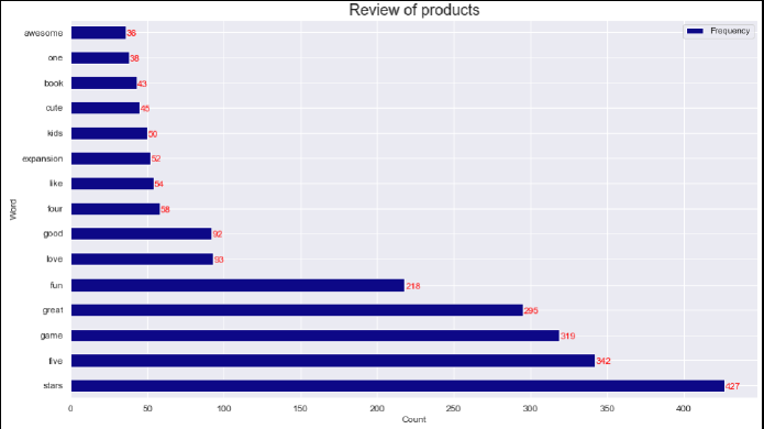
To gain deeper insights into customer reviews, Natural Language Processing (NLP)
techniques can be employed. Conducting sentiment analysis allows us to identify the 15 most
commonly used words, as well as the top 20 positive and negative reviews received. By importing
and cleaning the data, we were able to tokenize the words and generate a word cloud, aiding in
better understanding the sentiment expressed in the reviews.
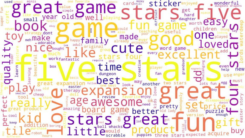
Upon analyzing the word cloud, it becomes evident that the prominently featured words are predominantly positive in nature. To validate this observation, we proceeded to plot the top 15 most frequently used words (Figure 8). Additionally, a histogram was created to illustrate the sentiment score polarity (Figure 9). These visualizations serve as further confirmation that the majority of the sentiment expressed in the reviews is positive.
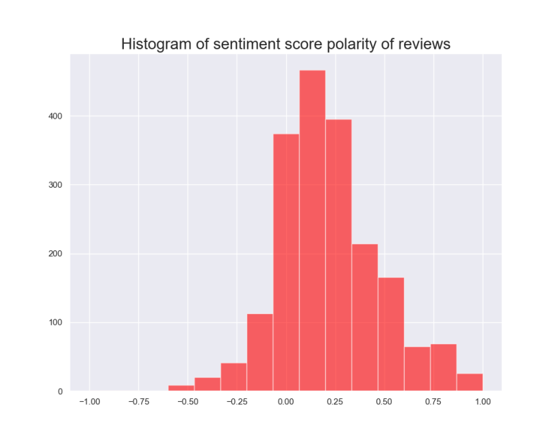
The aforementioned visualizations indeed validate the existence of
a positive sentiment towards the products, and the polarity extends
beyond the neutral and positive ends of the sentiment scale.
Furthermore, we successfully presented the top 20 positive and negative reviews.
However, it is important to acknowledge one of the limitations of
utilizing Natural Language Processing (NLP), which lies in the potential for
incorrect interpretations of words or reviews. Figure 10 illustrates this issue
when examining the list of the top 20 negative reviews. It becomes apparent
that some of the reviews are actually positive in nature, but the NLP model
has erroneously classified them as negative. This highlights the importance
of cautious interpretation and manual review when working with NLP results to
account for potential misclassifications.
When considering the sales data, it is challenging to precisely determine the specific
impact of a product on overall sales based solely on the available data. This limitation
arises from the absence of sales trend data over time, as our dataset only includes
information for the year each product was released.
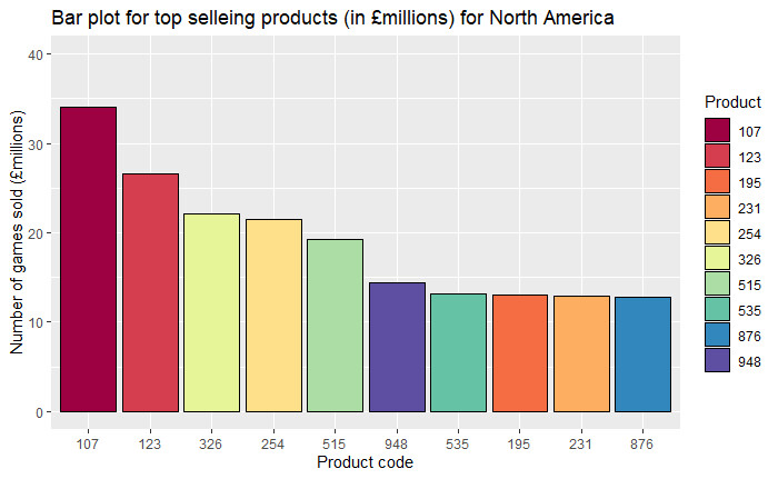
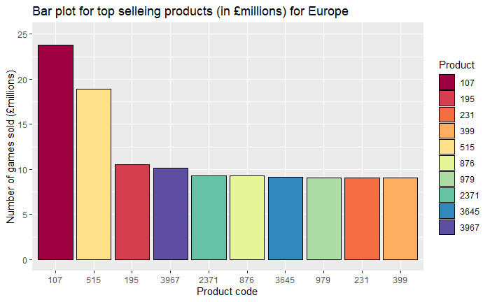
Nevertheless, by grouping the data according to the "Product" category,
we can identify the highest and lowest selling products within the two regions.
This analysis enables the marketing team to focus their efforts on promoting the
right products, thereby enhancing sales. While we may not have a comprehensive understanding
of the overall impact of each product, this information empowers the marketing team to
strategically tailor their marketing campaigns to drive improved sales performance.

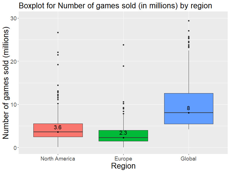
We can see from Figure 13 that North America has a higher median number of sales compared to Europe and all regions have many outliers. The Histogram helped to visualise this also.
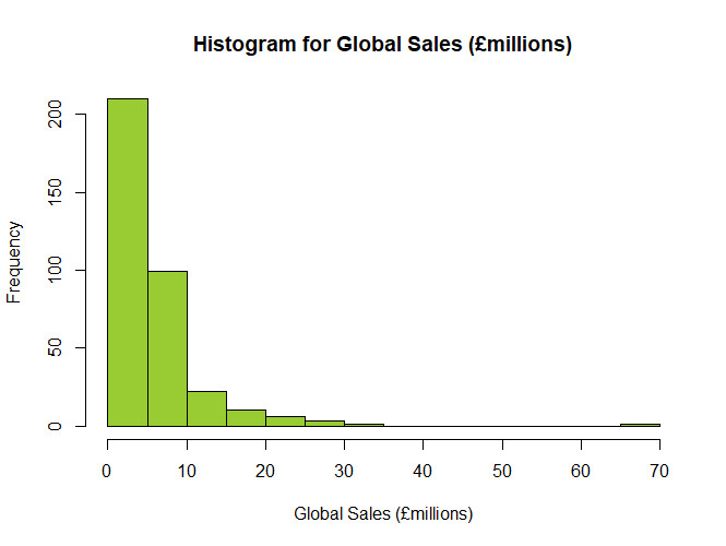
Figure 14 shows that the data is skewed to the right and so the few larger values raise the mean higher than the median. This is not a normal distribution. We can confirm this by running the Shapiro-Wilk test; skewness and the kurtosis functions.
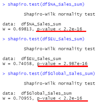
Figure 15 shows that the p-value is less than 0.05 for all three regions, meaning that the null hypothesis should be rejected and therefore the sales data is not normally distributed.
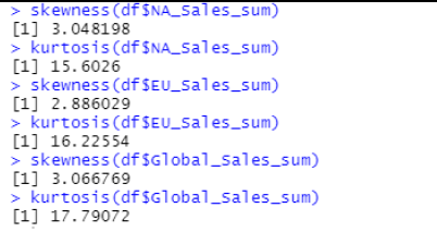
Figure 16 shows us that the skewness values are positive indicating
that the tail is on the right side of distribution and the Kurtosis
is leptokurtic (heavy-tailed), meaning that data produces more outliers
than a normal distribution.
If data is not normally distributed it could impact any machine learning
models that we use for predictive analytics. We would need to remove any outliers,
but this could reduce the data sample and so it would be best to get a larger data
set so that we can get a more distribution.
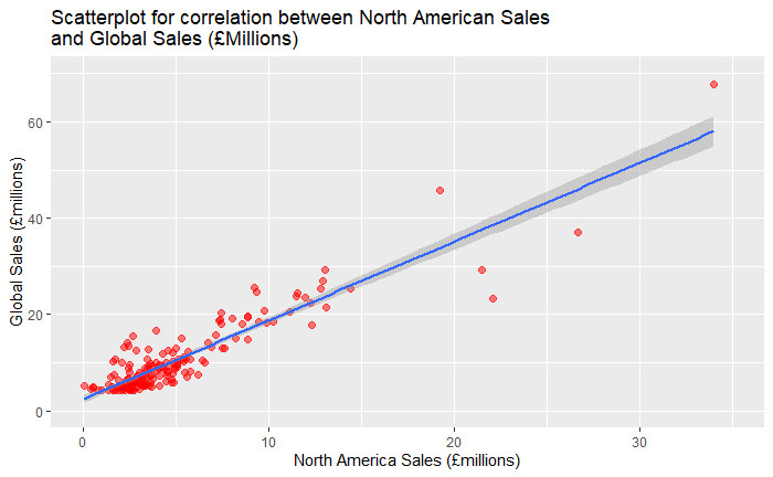
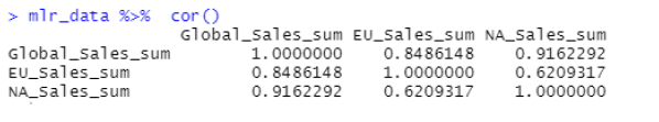
To confirm if there are any relationships between North American,
European, and Global sales, we are able to create a linear regression model
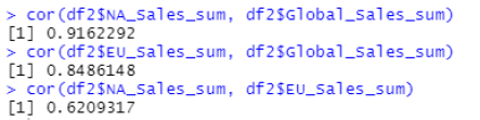
The cor() values show us that there is a positive relationship between all 3 regions but the strongest correlation (91.6%) is between North American Sales and Global Sales. By plotting the relationships, we are able to visualise this relationship (Figure 18).
As there are multiple variables, a multiple linear regression model is more appropriate to assess the effect of the variables on the dependent variable.
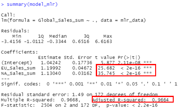
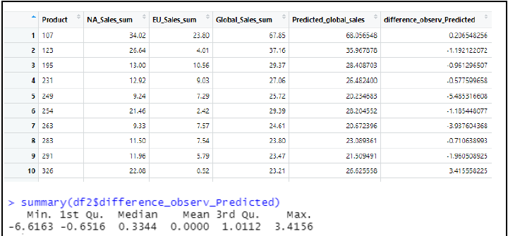
The summary statistics for the multiple linear regression show us that we can be very confident with our model; the p-values are less than 0.05, and the adjusted R-squared value is very high (96.6%). This tells us that EU_Sales and NA_Sales are highly significant variables in relationship to Global sales. We can use this model to test its ability to predict the global sales and compare with what was actually observed.
From our analysis, we have been able to identify the key groups of customers shopping at Turtles Games,
based on renumeration and spending scores and the best groups to target to boost sales (Groups 1 and 0 from Figure 6).
Our sentiment analysis demonstrated that customers had predominantly positive sentiments towards the company
and the sentiment polarity distribution was more neutral to positive. We were able to identify the highest and
lowest selling products for all regions and so Turtles Games will be better informed when it comes to
marketing so that they promote the most popular products.
In terms of relationships relating to sales data, our analysis showed that there was a positive
relationship with North American, Europeans sales and Global Sales; although, North American Sales had the
strongest relationship with Global sales and so this would be a key market to focus on also. We were able
to predict the Global sales with very strong accuracy using a multiple linear regression model. Questions
were raised regarding the distribution of the data and so to further our analysis, we would suggest getting
data from a bigger sample that is more representative of the normal distribution or data for a longer time frame.